
The famous Stock Market Soup Shop on Granville Island was acquired by new owners with a vision to not only carry on the tradition of delicious soup but to expand its customer base and reach. arithmetic was brought on board to rebrand and reposition the Public Market staple. While the soup recipes stayed true to their fame, the brand was in need of an updated brand palette—one that embraced its heritage and exuded market culture.
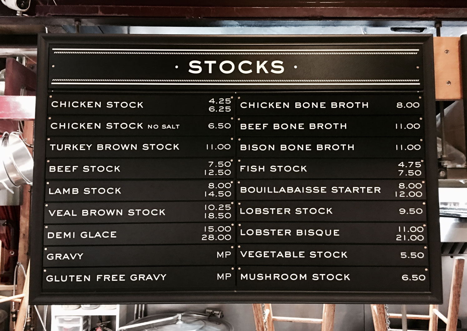
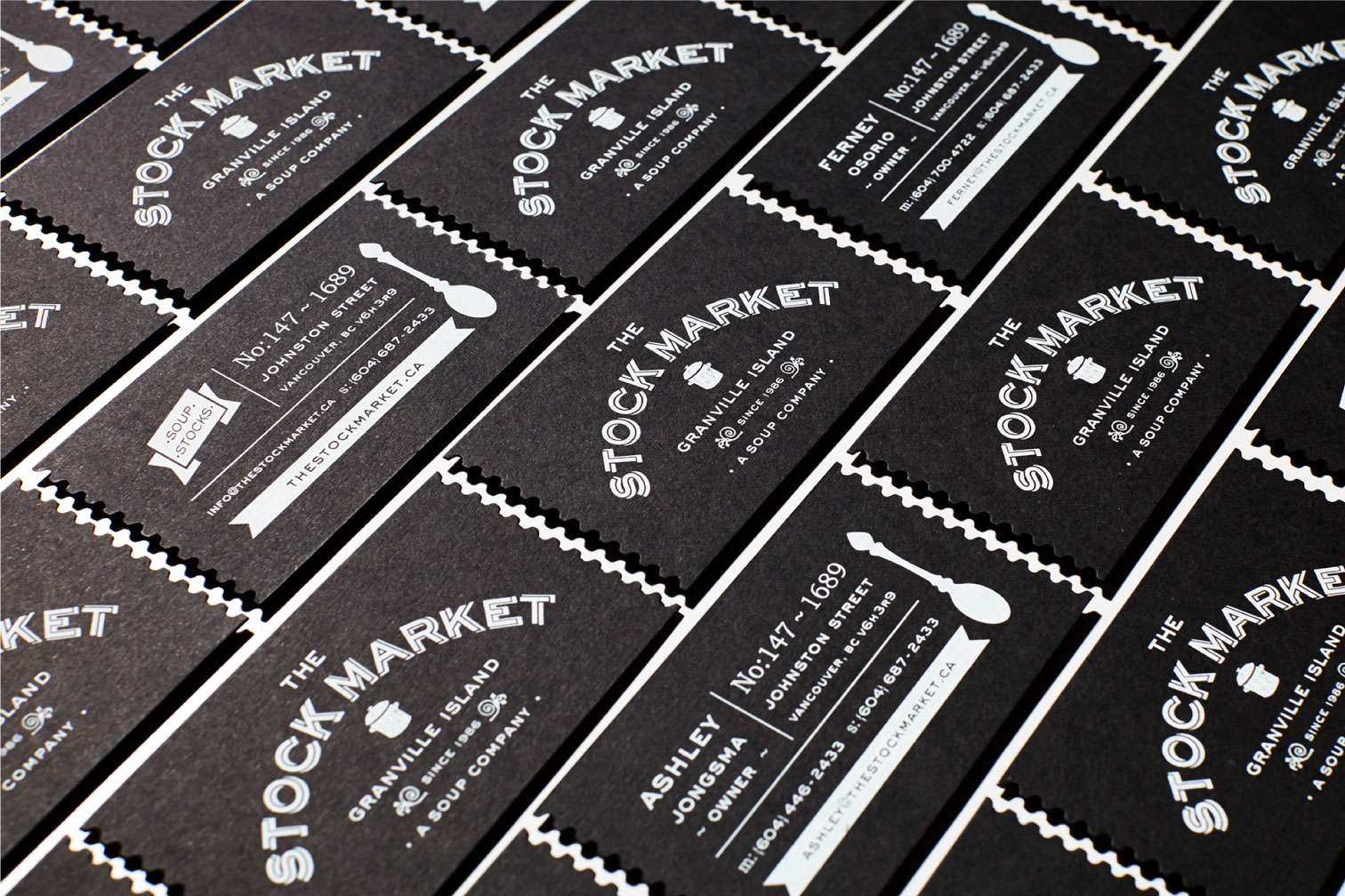
With a focus on celebrating the Granville Island heritage brand, arithmetic put extra care and attention to detail in developing an iconic mark, packaging program and signage system that would resonate with the customers that have grown to cherish the iconic soup shop over the years. The new hand-drawn image mark took the shape of a large utilitarian soup pot and a palette of black and white was introduced to the overarching brand structure, introducing a playful but rich colour palette within the product packaging.


With hundreds of products for sale, arithmetic devised a brand blocking strategy that categorizes each of the many products from soup and stocks to chutneys and preserves. Utilizing colour and graphic marks, each of the products easily merchandises on its own or within its collection.
Arithmetic’s re-design of the logo, labels and signage repositions the soup shop in revitalized heritage style—while elevating its perception and appealing to a broader demographic. Most importantly the path to larger-scale distribution has been paved.
