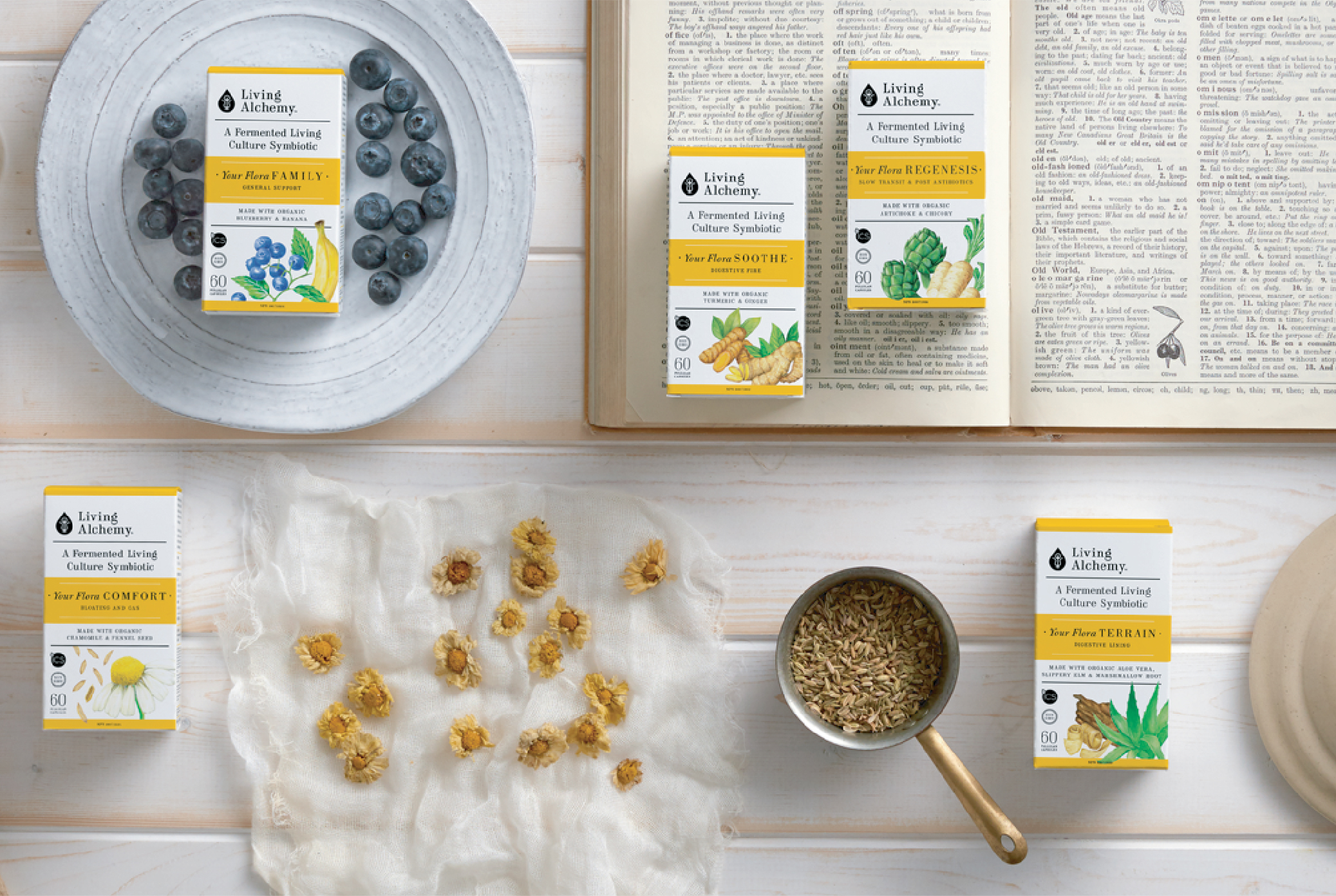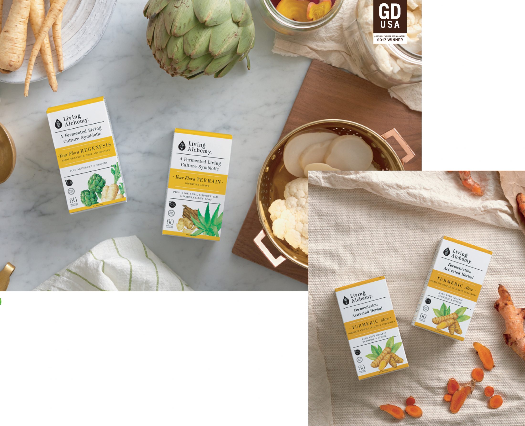
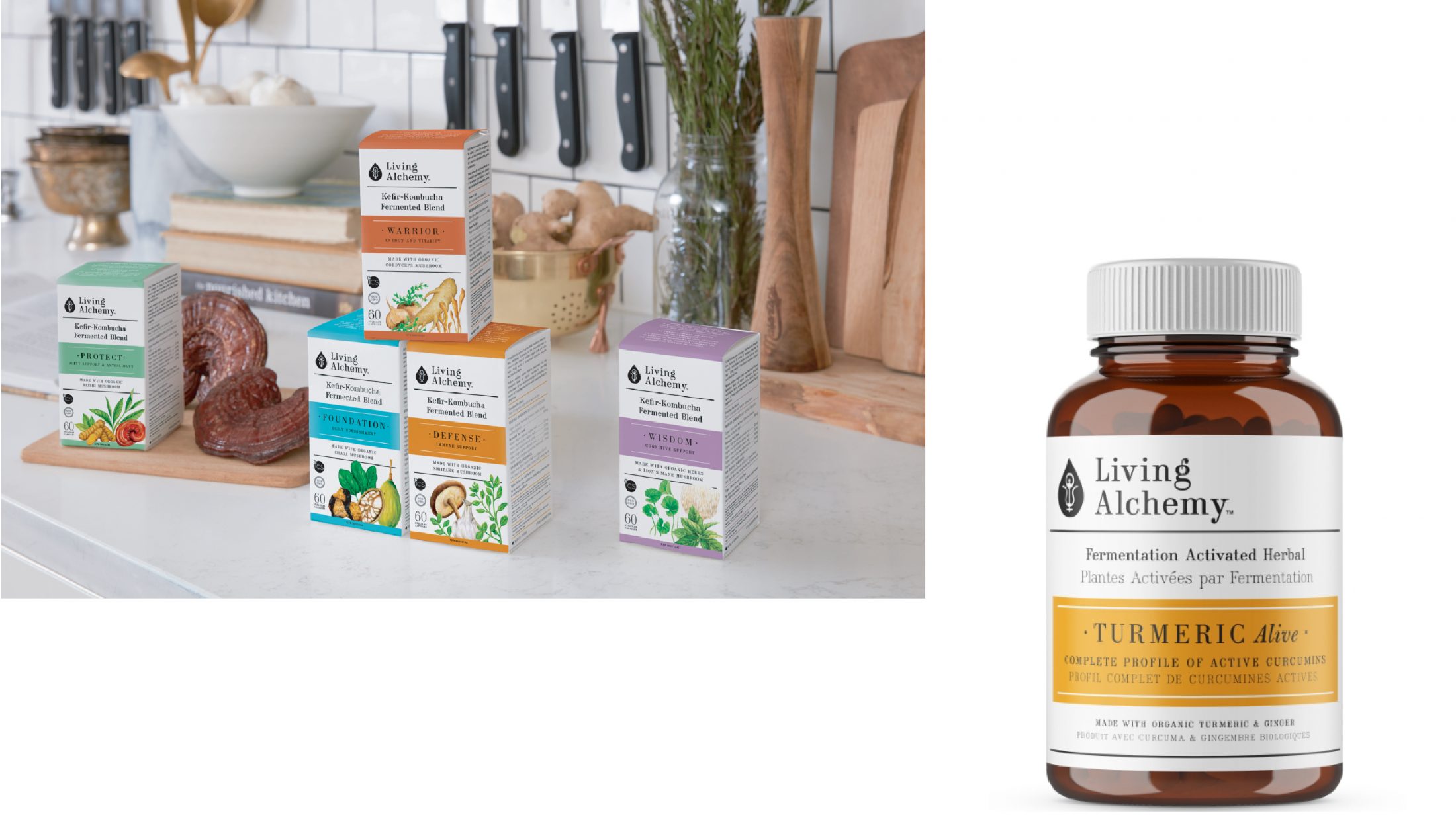
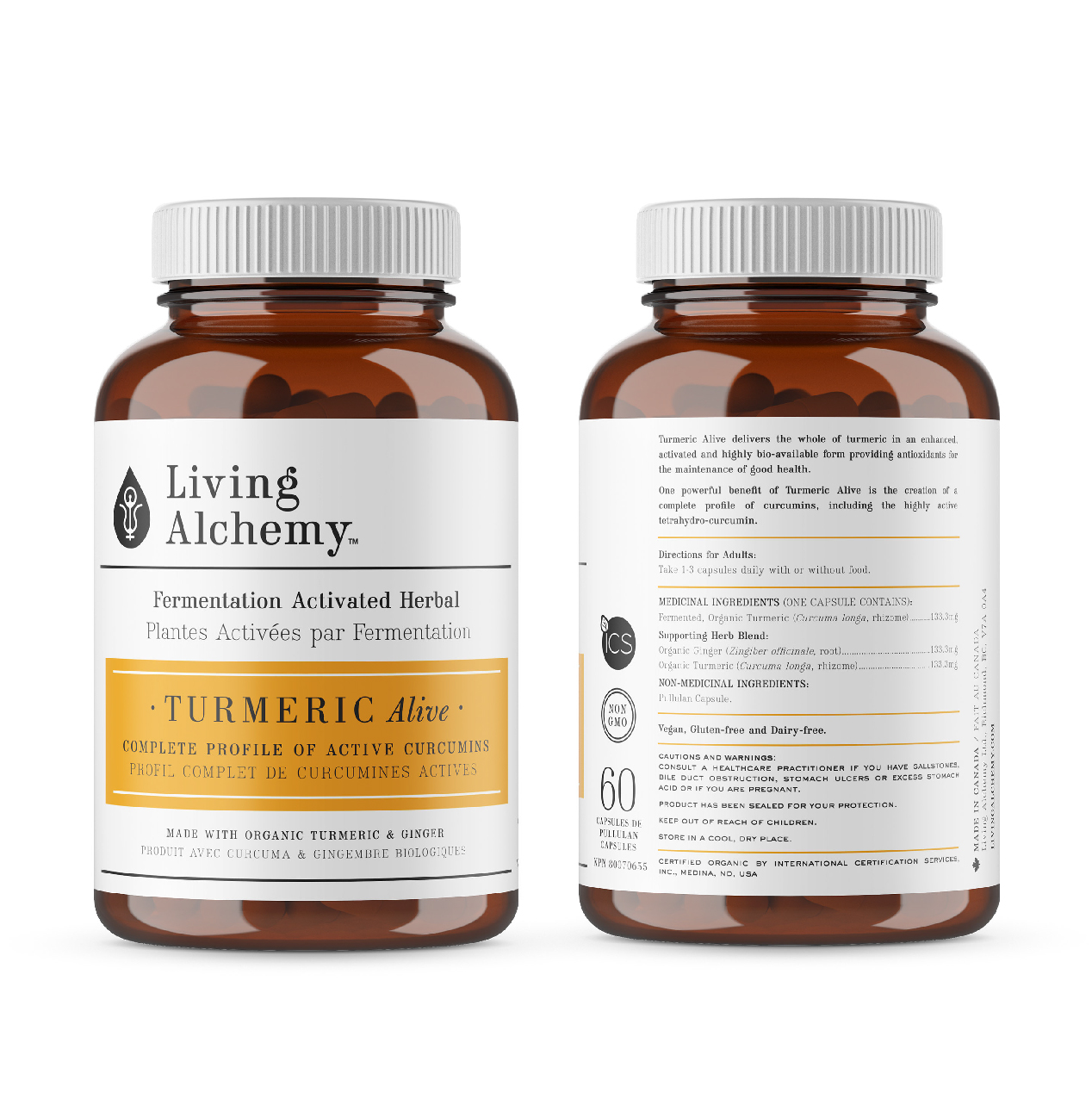
The founder and formulator of Living Alchemy created the highest quality certified organic, whole food supplements and enlisted Arithmetic to create a full brand and packaging suite. We developed the logo, art direction, illustrations, packaging and photography to encompass the brand’s focus on balance, purity, wisdom and self-love.
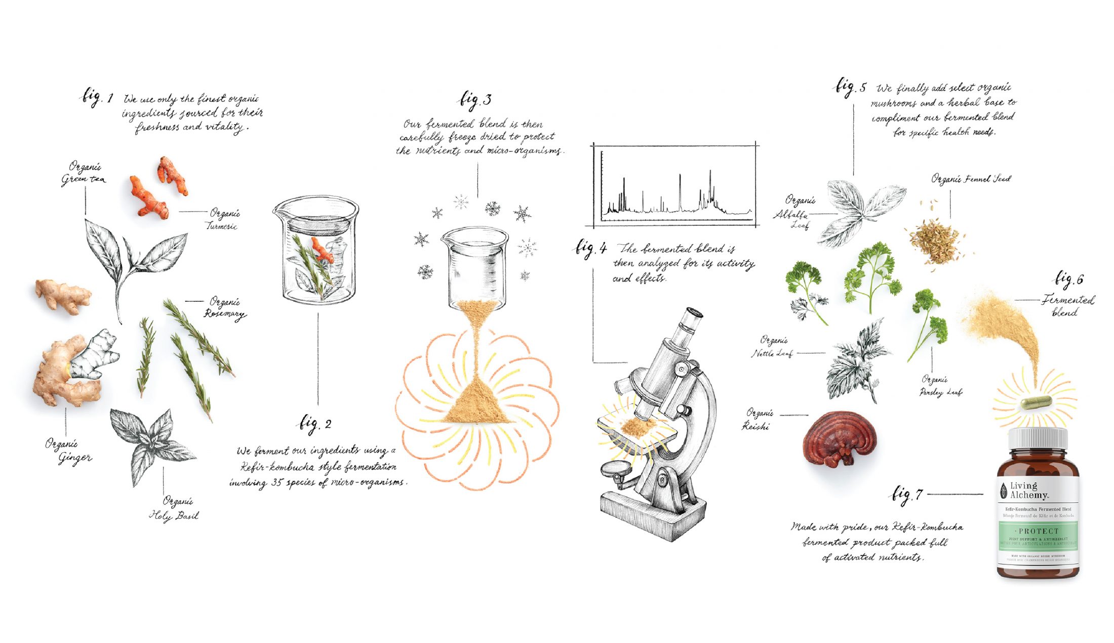
Throughout history, every culture has traditionally fermented its most prized foods to preserve and enhance their flavours and benefits. Naturally, the process works towards balance and perfection in form and function. Living Alchemy products are created with a unique kefir-kombucha fermentation process which develops the nutrients in the ingredients, bringing out the complexity and advantageous effects. Striving toward the full potential of your health and trusting in the wisdom of nature are fundamental acts of self care; Living Alchemy embodies a trustworthy brand with natural purity in mind, to give buyers a safe choice for healthful supplements.

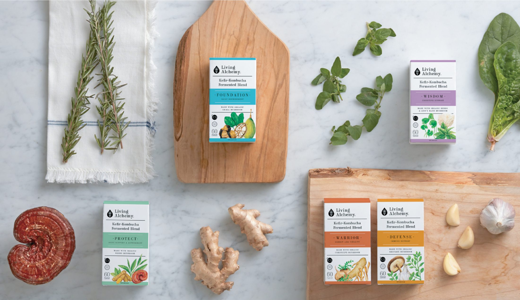
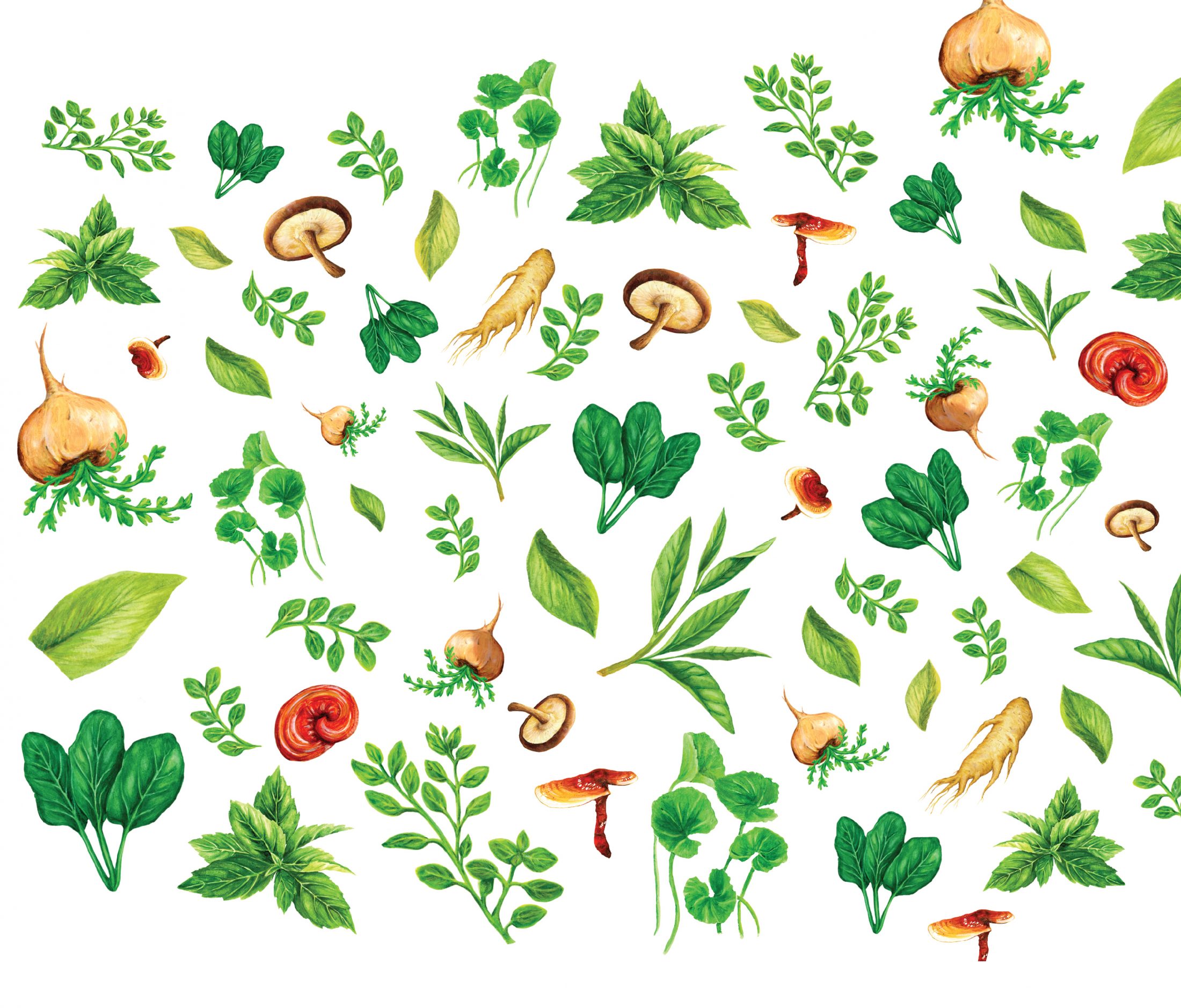
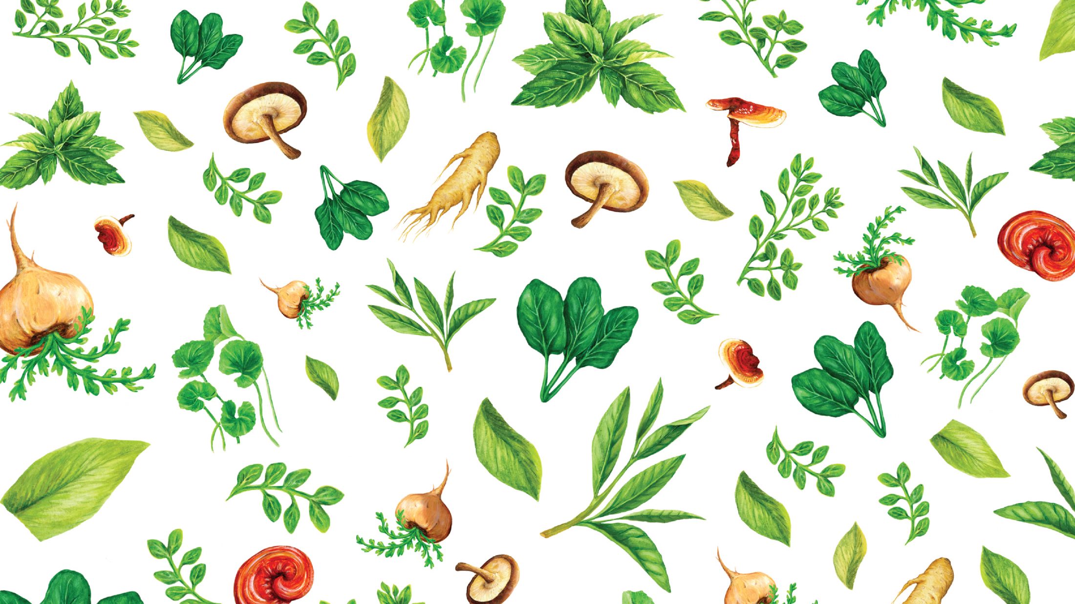
Settling on black and white as the primary brand colours, Arithmetic aimed to first and foremost, demonstrate purity, reliability and scientific rigor through the Living Alchemy brand. The secondary colour palette, which is limited to being used as accents, is a rainbow of colourful tones which speak to the natural array of ingredients within the products. Patterns consisting of ingredient illustrations were created to communicate the transparency of the brand and their focus on using pure, natural components. At its core, Living Alchemy is a wellness brand that helps people take the first step towards living their healthiest life.
