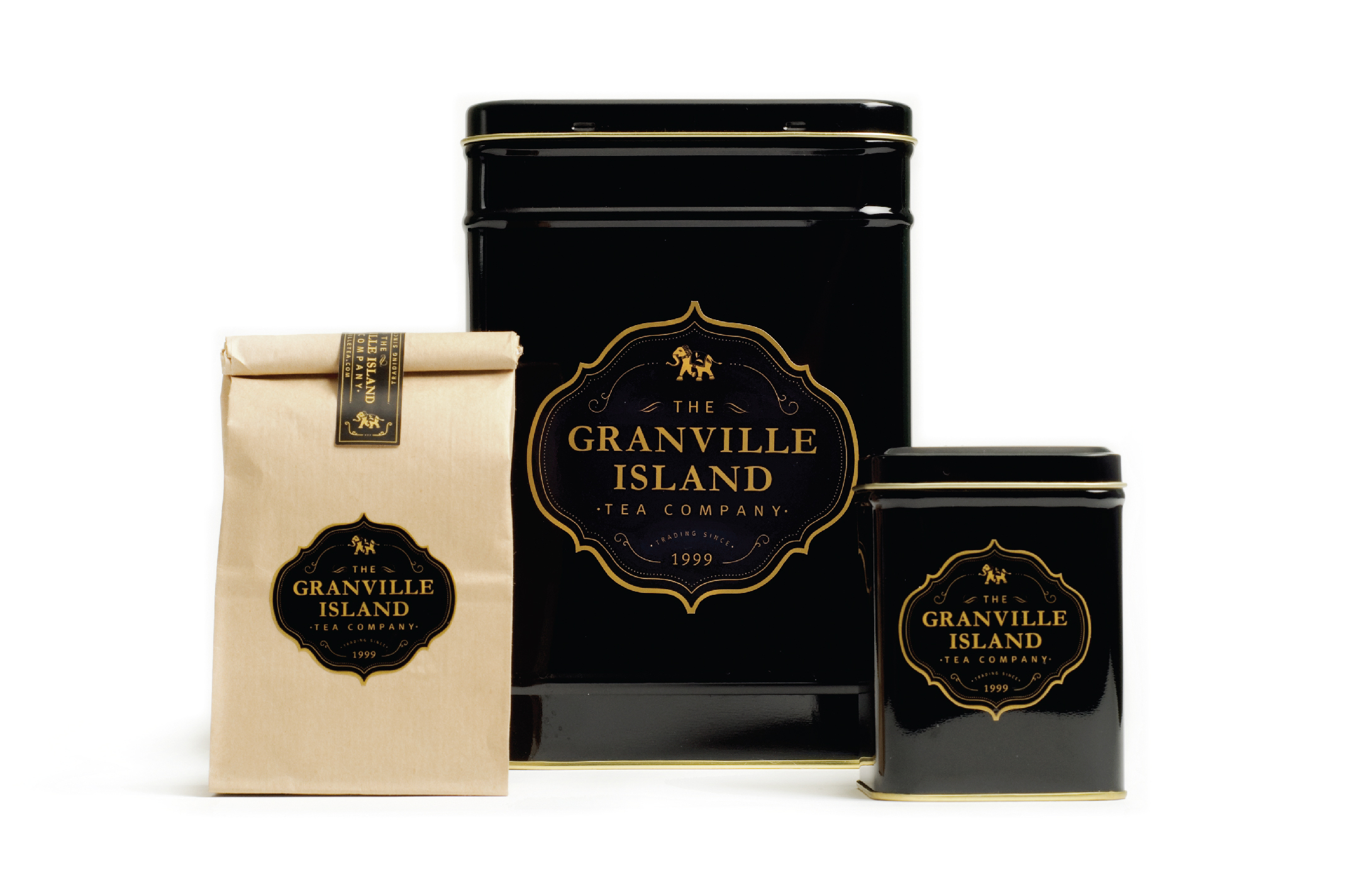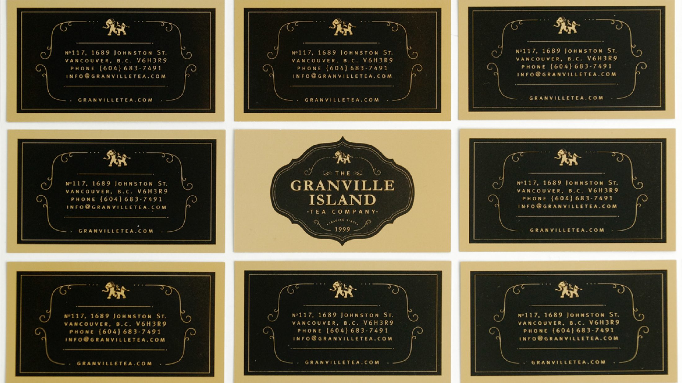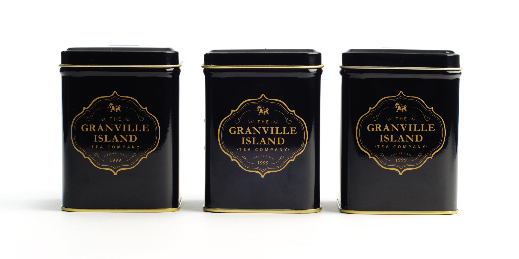
When the Granville Island Tea Company decided to move from their small shop into a larger retail space, arithmetic creative came on board to re-brand and reposition the Public Market staple. While the tea remained the same, the brand was in need of a new look and feel.
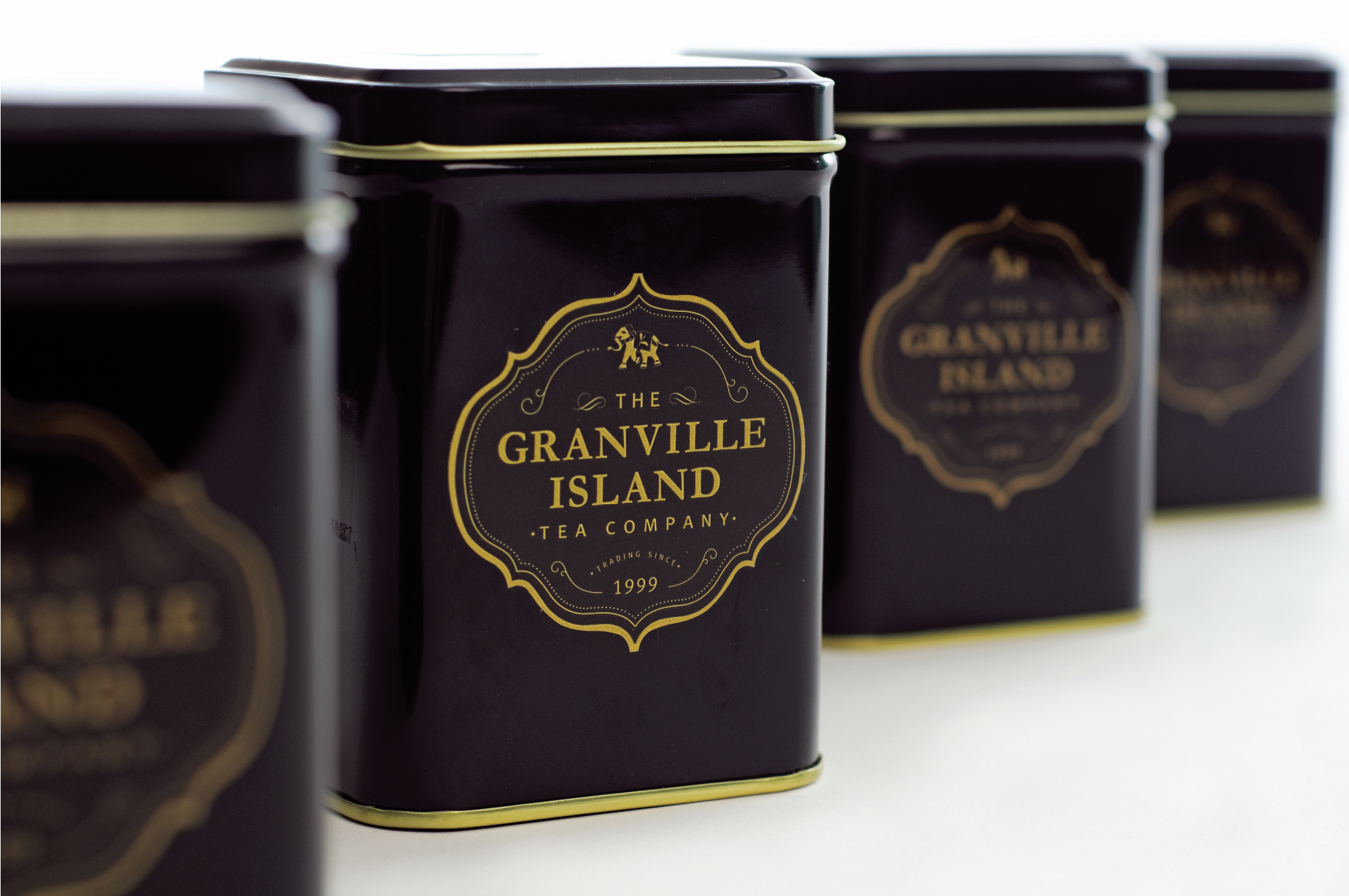
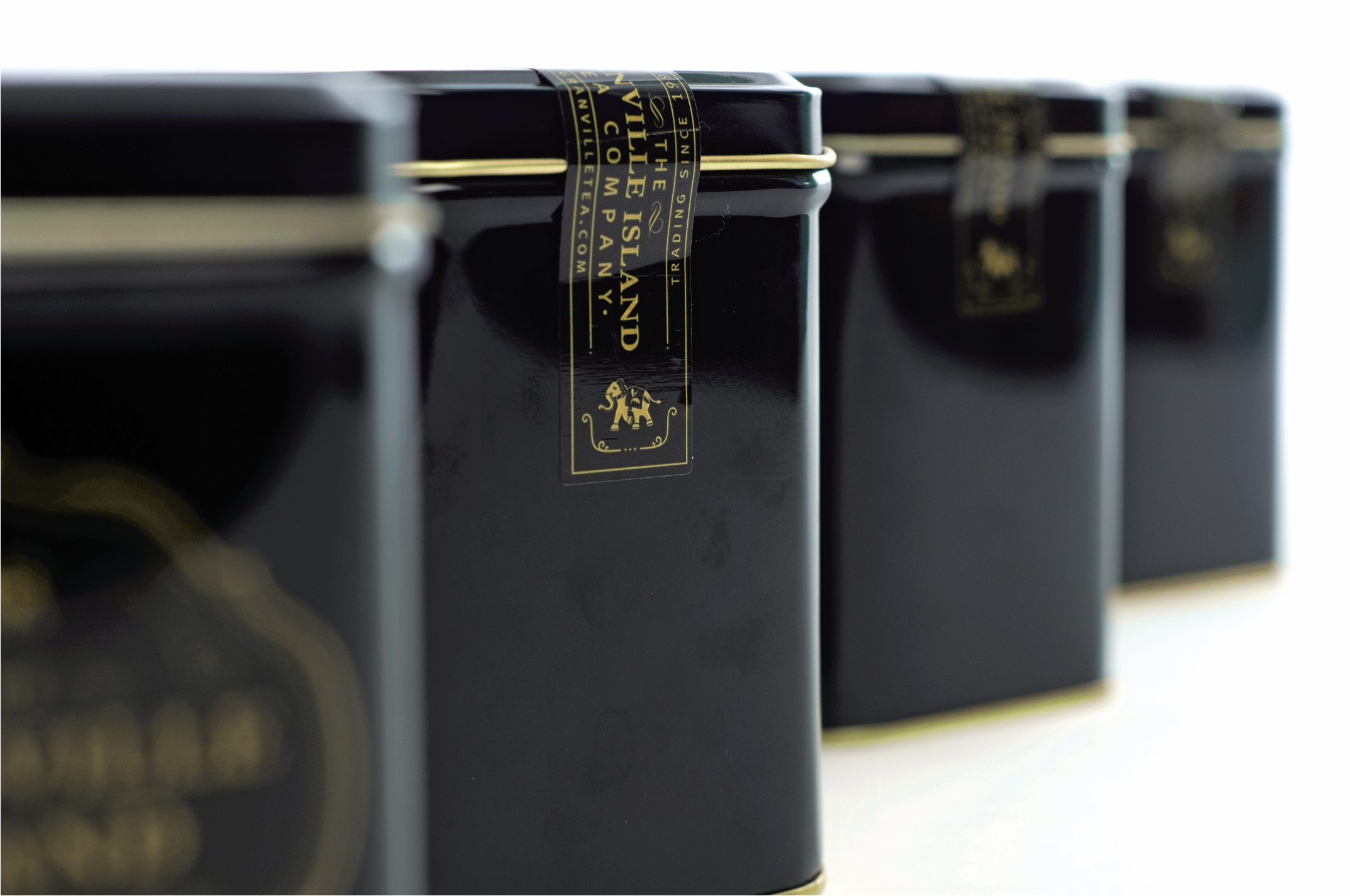
With a focus on revitalizing the Granville Island heritage brand, arithmetic put extra care and attention to detail to develop an iconic mark that would celebrate the rich history of tea and heritage tea shops that the owners were inspired by when first opening.
With careful consideration to ensure that the many loyal customers would retain a connection to their favourite tea shop, arithmetic played homage to the richness of tea trading companies from the past by moving away from the green tins and introduced a regal colour story of gold and black and developed a logo and packaging system that celebrates the quality and craft of the tea products through flourishes and fine line detailing.
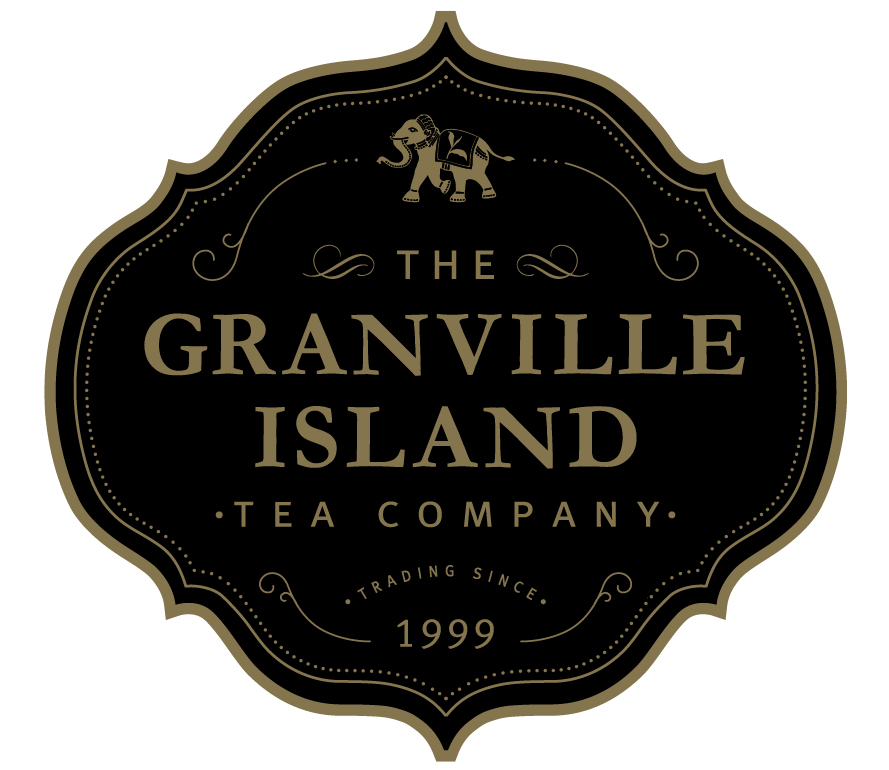
arithmetic’s re-design of the logo, labels and tins preserves the legacy and heritage of the brand—while elevating its perception and appealing to a broader demographic.
