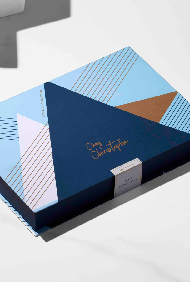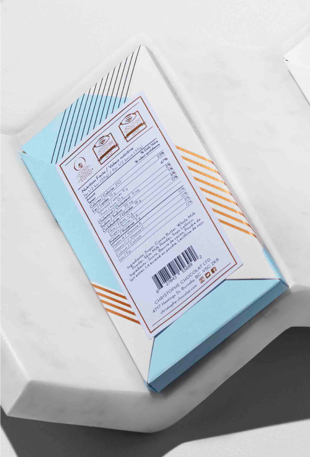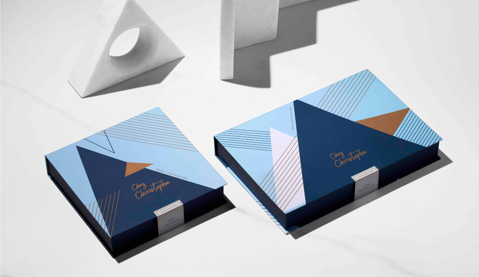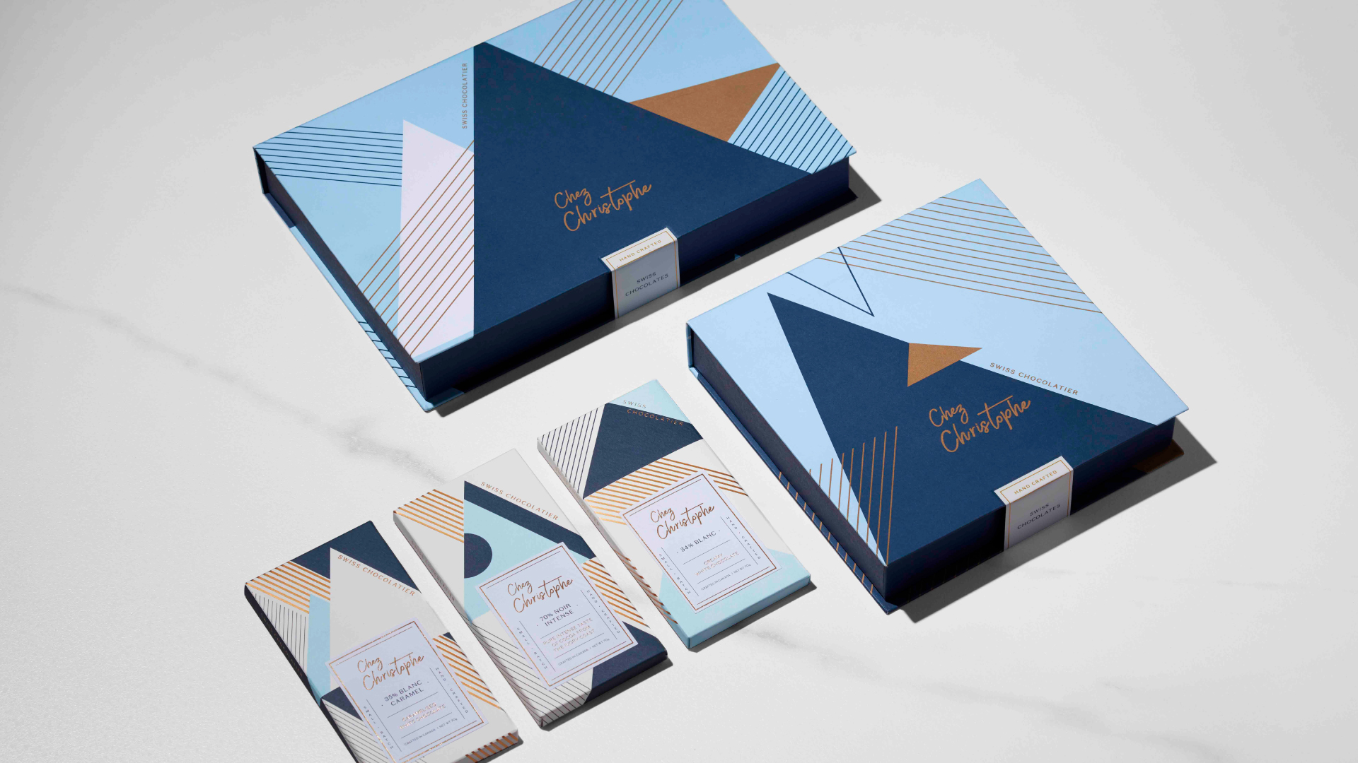
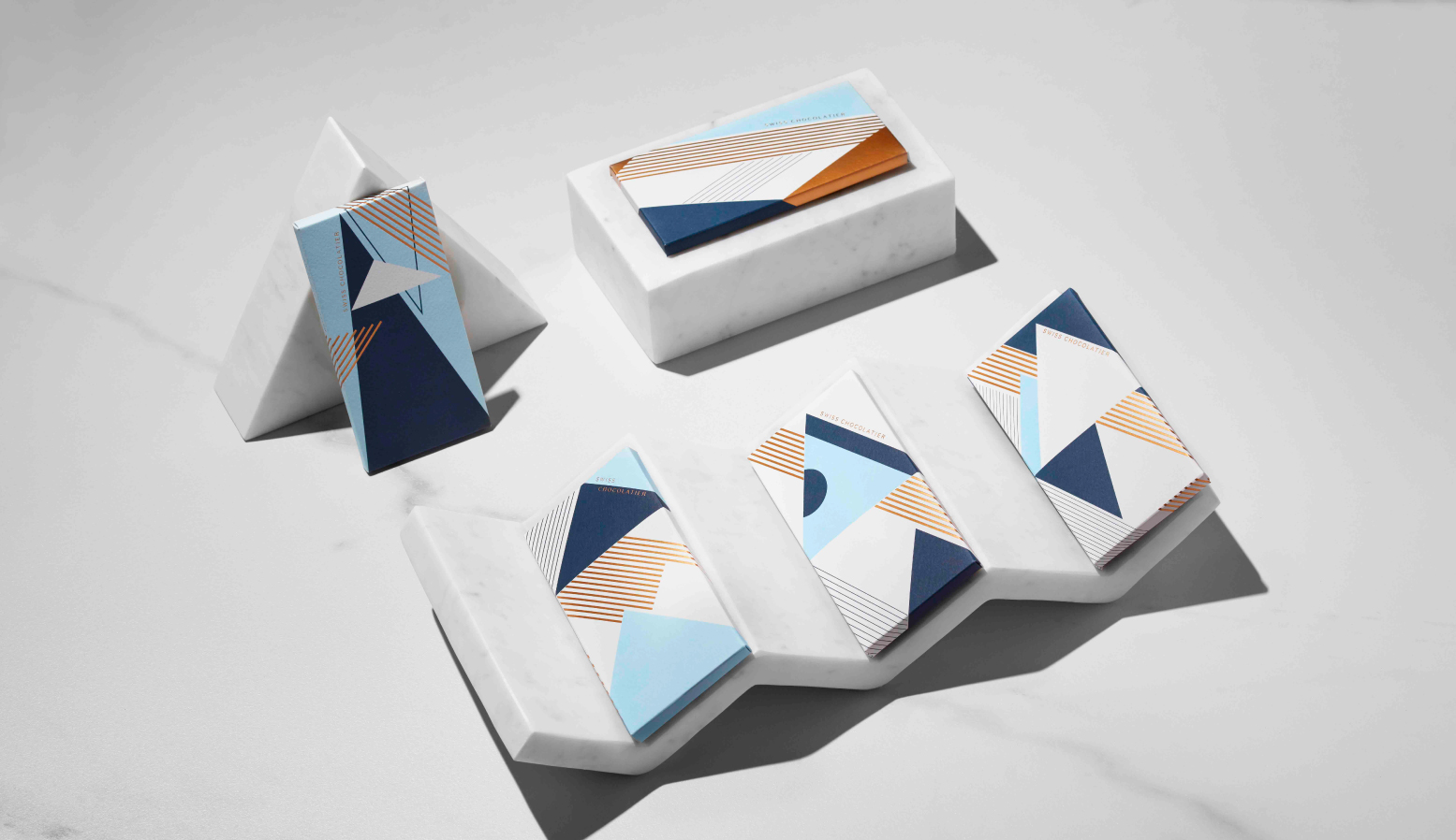
The overarching art direction for Chez Christophe’s Swiss Chocolate brand was based on connection—connection to each other and to the vastness of nature. Love is at the heart of connection. Our objective was to express this love through the craftsmanship of the luxury packaging and the graphic language in the packaging, shown through the use of a substantial uncoated textured stock and the use of gold foil and folding systems.
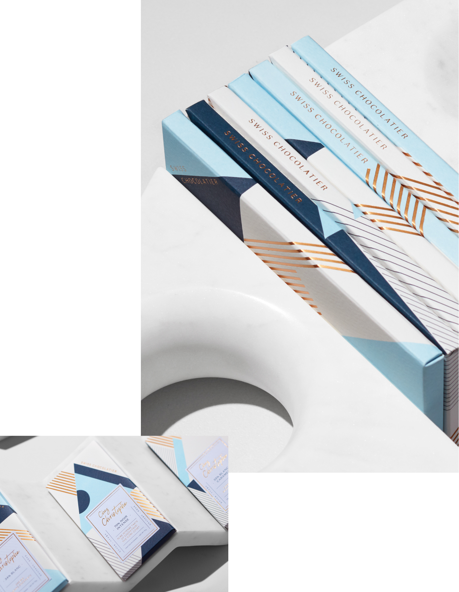
In celebration of the chocolatier’s Swiss roots, we were inspired by the Swiss Art Deco lacquer designs of Jean Dunand (1877-1942). Using geometric forms in primarily triangle formations and repetitive line work, we developed a graphic language that nods to the peaks of the Swiss mountain range, synonymous with the origins of the most delicious tasting chocolate—a non-literal graphic solution to the typical approach of depicting the origin roots of the Swiss Alps. The interior package depicts a linear graphic scene and the founder’s story.
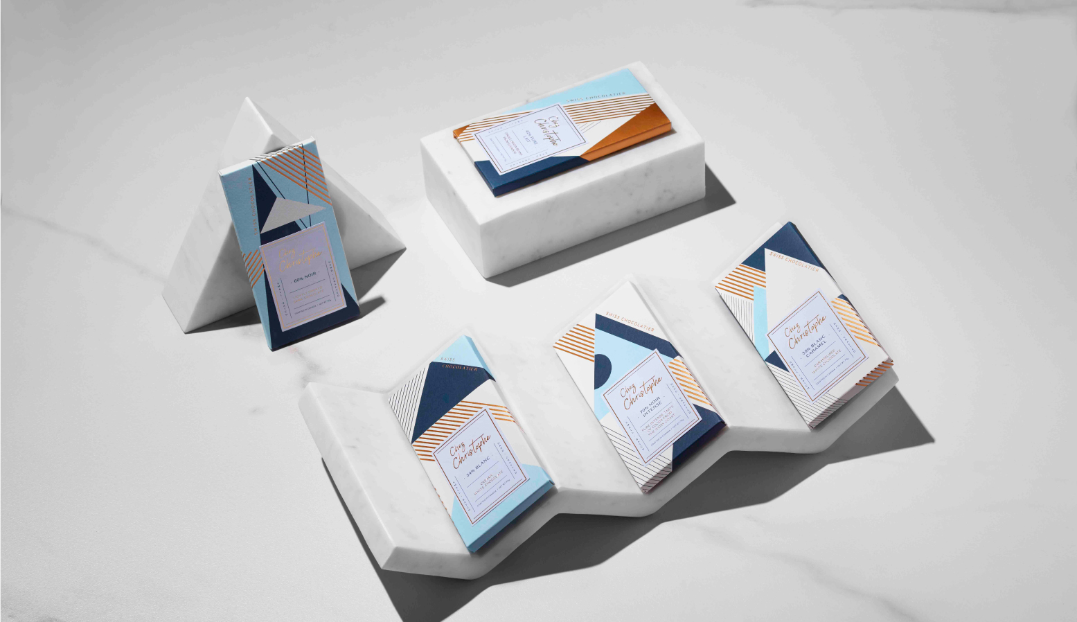
The type treatment on the label design echoes the packaging influence of Art Deco Geometrica.
We celebrated the founding logo with a contemporary update. By retaining the curvature of the founding logo, and updating with a focus on humanizing the shapes, we were able to capture the aesthetics of a romantic and approachable appeal.